Running head: COLOR PSYCHOLOGY 1
Color Psychology and Graphic Design Applications
Rose Rider
A Senior Thesis submitted in partial fulfillment
of the requirements for graduation
in the Honors Program
Liberty University
Spring 2009
COLOR PSYCHOLOGY 2
Acceptance of Senior Honors Thesis
This Senior Honors Thesis is accepted in partial
fulfillment of the requirements for graduation from the
Honors Program of Liberty University.
______________________________
Todd Smith, M.F.A.
Thesis Chair
______________________________
Edward Edman, M.A.
Committee Member
______________________________
Edward Martin, Ph.D.
Committee Member
______________________________
Marilyn Gadomski, Ph.D.
Assistant Honors Director
______________________________
Date
COLOR PSYCHOLOGY 3
Abstract
Color filters humanity’s perception of the world and alters people’s relationships with
their surroundings. It influences human perception, preference, and psychology
throughout the lifespan. Color preferences appear in infants as young as three months old,
and typically change with age. Some responses to color may be innate, and some may be
learned from nature or culture. Cool hues are relaxants, and are generally preferred over
their more arousing warm counterparts. Color is a subtle but pervasively influential
element in graphic design. It permeates graphic representations in packaging, advertising,
and branding. Slight variations in color can advance or devastate design effectiveness and
have massive economic implications for companies and products. Whether audiences are
conscious or unconscious of color’s impact, its hypnotic potential makes it a worthy asset
for any visual communicator. A study assessed the point, if any, at which the joint effects
of brightness and saturation cause a viewer to prefer a yellow color to a blue color.
COLOR PSYCHOLOGY 4
Color Psychology and Graphic Design Applications
Color as a Filter
Color is a powerful medium through which man views the world. Unlike most
animals, which see only shades of gray, humans are exposed to this marvelous additional
dimension of vision (Bleicher, 2005). Color influences human perception, preference, and
psychology. The subtle but powerful influence of color is an inviting study for
psychologists. When applied skillfully and intentionally, color is a valuable
communication tool for graphic designers.
Color Perception
What humans perceive as color is actually lightwaves reflected off a surface
(Bleicher, 2005). Surfaces absorb all the spectral hues except for those that bounce off in
the form of visible color. A specific color is composed of three elements: hue (the
common name of a color, e.g., red or blue), value (brightness), and saturation (vividness
or lack of gray; Valdez & Mehrabian, 1994). Faber Birren (1997) described the natural
shape of color as a triangle, with white, black, and any given pure hue making up the
three corners, and a gradient of tints and shades in the middle.
The human retina contains rods and cones, specialized cells that perceive different
aspects of vision (Bleicher, 2005). Rods are long and cylindrical, able to perceive only
value. Cones are wider, conical receptors that perceive color. Humans have 100 million
rods but only 6 million cones in each eye, thus making value easier to perceive than
color. This is why vision in low light appears almost colorless.
There are also cases of responses to color not perceived by the eye. Light and
color therapy have been used to treat jaundice, skin conditions, and sleep disturbances
COLOR PSYCHOLOGY 5
successfully. One researcher found that blind subjects reacted to colored rooms just as
seeing subjects did. Theories have also been constructed to explain the phenomenon of
dermo-optic vision, the ability of some humans to feel color. One such theory suggests
that humans have receptors in the skin that sense color wavelengths (Bleicher).
Difficulties in Color Psychology
Color psychology is a young field that is largely unexplored. In a field striving for
establishment, there are two chief difficulties for serious students of color psychology.
First, the student must differentiate between science and the occult. Faber Birren, a well-
known pioneer of color psychology, was heralded for “daring” to learn from occultists
and mystics (Morrow, as cited in Birren, 1997, p. ix). Angela Wright (1998) mentioned
the mystic aura said to surround human beings in one paragraph, and Newton’s theory of
color in the next.
Second, the student of color psychology must take care to recognize valid
scientific conclusions reached through appropriate methodological means. One must also
be wary of vaguely worded results because of the difficulty in measuring emotional
responses to color stimuli objectively and quantitatively (Valdez & Mehrabian, 1994).
The impartiality of researchers, number of subjects analyzed, standardization of colors,
and regulation of variables are key to valid research. Anything else may be more
speculative than factual. McManus, Jones, & Cottrell (1981) called results obtained under
substandard conditions or with faulty methodology “generally worthless” (p. 651).
Many early experimenters studied only hues, which they frequently identified by
name only (Valdez & Mehrabian, 1994). In recent years, color psychologists have taken
greater care also to specify and test the brightness and saturation of precise colors rather
COLOR PSYCHOLOGY 6
than broad hues. Most now use colors from standardized systems such as the Munsell
Color System. They also use carefully monitored lighting designed to approximate
daylight. All variables other than the one being tested should be regulated to provide a
consistent testing environment capable of yielding accurate results (Valdez &
Mehrabian).
Color Psychology
Color Preference
Researchers have conducted color preference studies in many age groups and
have found significant results. Infants as young as three months old consistently stared at
some colors longer than others (Crozier, 1999). They stared longest at red, then yellow,
blue, and green. Color preferences appear to shift with age, however. Five-year-olds also
preferred red, but ranked other colors as follows: blue, purple, orange, yellow, and green.
Further shifts in color preference occur with maturity and adulthood. Most significantly,
adults begin to prefer green and blue, while beginning to dislike yellow (Crozier).
Color preference studies have found slight variations in adult hue preference, but
this classic hierarchy that Eysenck (1941) established has been generally correct for sixty
years: blue, red, green, violet, orange, and yellow. It was found to be true across both
genders and ethnic groups. Faber Birren (1997) declared it the “eternal and international
ranking” (p. 176).
This does not imply, however, that traits such as gender and ethnicity have no
bearing on response to color stimuli. Extroverts generally prefer brighter colors, whereas
introverts prefer lighter, more subdued tones (Crozier, 1999). Some cultures prefer red
and/or green to blue (Birren, 1997). Valdez and Mehrabian (1994) discovered that
COLOR PSYCHOLOGY 7
although the genders responded very similarly to variations in saturation and value,
women were more sensitive to the variations than men were. Khouw (2002, as cited in
Singh, 2006) found the genders differed in perception of grayscale tones and color
combinations. Women also became more confused and distracted than their male
counterparts.
Color preference research commonly has studied only hues; but the other two
dimensions of color, brightness and saturation, play a large role in the overall appearance
and emotional effects of any given color. Valdez and Mehrabian’s (1994) study
simplified much of the color psychology field by testing the effects of hue, saturation,
and value on emotional response. They discovered relatively simple patterns in which
brightness and saturation had substantially greater effects on emotions than hue. It is
because of such research that the findings of early experiments that studied and specified
only hues must be read with discernment.
Color Response
Nature and nurture. One of the chief questions to arise in color psychology is
the question of behavioral origins. Studies seek to determine if responses to color stimuli
are innate, learned, or some combination of the two. Although research with infants
indicates that innate reactions do exist, variation in color response across demographics
suggests that much of adult color response is learned (Crozier, 1999).
Innate response. As mentioned in the previous section, Choungourian (as cited in
Crozier, 1999) found that three-month-old babies stared longer at long-wavelength colors
such as red and yellow. Many animals with color perception also show innate
preferences, but, ironically, for short-wavelength colors such as blue and green. One-day-
COLOR PSYCHOLOGY 8
old northern bobwhites were most inclined to peck pinheads colored blue, then green,
yellow, and finally red (Mastrota & Mench, 1995). This was almost exactly the opposite
of human babies’ rankings of color preference. Moths, bumblebees, and robins also
showed preferences for blue (Crozier). Gorillas and chimpanzees greatly preferred blue
and green to red (Wells, McDonald, & Ringland, 2008). If these animal responses are
innate, humans differ drastically from animals in innate color response.
Learned response. Although some mature human responses to color stimuli may
be innate, many others appear to be learned. These learned responses may result from
either natural or cultural color conditioning (Crozier, 1999).
Natural color conditioning occurs when a positively or negatively perceived
natural element casts its own positive or negative connotation on a related color. It can
operate universally and cross-culturally. For example, Hemphill (1996) speculated that
the world’s favorite color, blue, may owe its popularity to the ocean and sky on sunny
days. If the preference for blue is learned from nature, Hemphill’s theory offers a credible
explanation for why infants and children do not like blue as much as adults do. Consistent
with this theory, Hemphill also found negative responses to gray, which subjects
associated with rainy, overcast days.
Cultural color conditioning plays a significant role in shaping responses to color
stimuli. Different cultures vary in their use of color, affecting individual responses. For
example, the Ndembo of Zambia do not recognize orange as a color, whereas the Hindus
consider it sacred (Singh, 2006).
Traditional and religious symbolism play major roles in culturally-conditioned
color preference (Fehrman & Fehrman, 2004). Early Asian movements such as
COLOR PSYCHOLOGY 9
Hinduism, Buddhism, and Confucianism promoted yellow and orange (Birren, 1997;
Singh, 2006). Muslims and Celts shared green as their sacred color (Singh). Christianity,
while not embracing colors as sacred, contributed strong salvation-related meanings to
red, white, and black. Other color associations, such as white in weddings, red ink used to
mark mistakes, and figures of speech such as green with envy influence color evaluation.
Since so much response to color is learned, it is challenging but important for researchers
to differentiate between learned and innate responses (Fehrman & Fehrman).
Responses to hues of different wavelengths.
Hue classes. Colors are paradoxes. They affect emotions, behaviors, preferences,
performance, and physiology in many different, and sometimes contradictory, ways. Two
classes of hues exist, arranged according to wavelength. Each class is distinct, generally
exerting influences opposite to those of the other class.
Warm hues. Although it is difficult to assess the psychological effects of color
objectively, most researchers are in general agreement that long-wavelength colors
(warm hues such as yellow and red) are more arousing than short-wavelength colors
(cool hues such as blue and green; Valdez & Mehrabian, 1994). Warm colors raise the
heart rate and increase hunger (Berman, 2007). This makes them popular choices for fast-
food restaurants. They are also eye-catching and appear as warning signs on fire trucks,
brake lights, stinging insects, stoplights, traffic cones, hazardous substances, and inmate
uniforms.
Red is perhaps the most studied, yet most disputed color. Researchers agree that it
is powerful and generally liked, but it is difficult to study conclusively. A study
conducted by Cimbalo, Beck, and Sendziak (1978) ranked red with black and brown as
COLOR PSYCHOLOGY 10
sad colors, but Hemphill (1996) found subjects associated it with happiness. It has
implications of passion and romance in relational contexts. Red is a popular choice for
sports teams. Hill & Barton (2005) found that when all other factors are equal, wearing
red can propel an athletic team to victory.
Despite its energizing qualities, red also has an intimidation factor. It makes
objects seem heavier and time pass slowly (Birren, 1997). Fashion experts warn against
wearing red for job interviews, as it may intimidate prospective employers (Berman,
2007). Elliot and Maier (2007) found the presence of red anagram tests significantly
impaired performance. However, Mehta and Zhu (2009) found that a solid red computer
wallpaper improved performance on detail-oriented computer tasks, likely through
avoidance motivation because of red’s association with danger and mistakes.
Yellow and orange share many of the same properties. Color theorists agree that
yellow is a happy hue (Cimbalo et al., 1978; Hemphill, 1996). It has pleasant
connotations of sun, brightness, and warmth (Cimbalo et al.). Ironically, it is also the
least-preferred hue. Like red, it raises the pulse, but not to the same extent. In soft,
creamy tones, yellow is soothing (Berman, 2007). It often appears brighter than white to
the human eye (Birren, 1997), and is a popular color for attracting attention in everything
from packaging (Berman) to road signs. Orange is another happy but unpopular warm
hue (Cimbalo et al.). It also draws attention and stimulates the appetite (Berman). As the
hybrid of yellow and red, its bright yet powerful properties have made it a popular color
for marketing cleaning products.
Cool hues. Cool hues, on the other hand, are recognized as more relaxing, and are
collectively much better liked (Crozier, 1999). Blue is a foil to red in almost every way,
COLOR PSYCHOLOGY 11
lowering blood pressure (Birren, 1997), stimulating creativity (Mehta & Zhu, 2009), and
stifling hunger (Bleicher, 2005). Blue is a popular choice for traditional restaurants
because it relaxes customers and encourages them to linger, making them more likely to
add to their orders. Contrary to red, blue makes objects seem lighter and time pass more
quickly (Birren). Like red, its happiness properties are disputed. In a study conducted by
Cimbalo et al. (1978), children labeled it happy, but college students called it sad. It is a
pervasively popular wardrobe choice, as the major color in half of all clothing
combinations (Hemphill, 1996).
Green’s psychological effects vary widely with its different tones. A happy color
(Cimbalo et al., 1978), it is primarily associated with nature, trees, and vegetation
(Hemphill, 1996), which often gives it a relaxing quality. Dark green connotes wealth and
status (Berman, 2007), but pea green is associated with nausea (Fehrman & Fehrman,
2004). Green also has creepy associations with death, poison, and supernatural or
extraterrestrial phenomena. Birren (1997) described it as a psychologically neutral color,
representing a withdrawal from stimulus.
Importance of context. Color preferences and responses, however, are entirely
subject to context (Elliot & Maier, 2007). Although blue is consistently preferred and
yellow consistently disliked (Crozier, 1999), most people would prefer yellow in the
context of a lemon or a wedding band. This concept of what Taft (1997, as cited in
Crozier, 1999) called “colour-object appropriateness” (p. 48) has significant bearings on
responses to color in different contexts.
COLOR PSYCHOLOGY 12
Application of Color in Graphic Design
Color Conversations
“…[T]he real value of color is intellectual, not decorative,” Jan White wrote
(1991, as cited in Nelson, 1994, p. 215). “It must not be used to dazzle, but to enlighten”
(White, as cited in Nelson). There is a sort of dignity employed in proper color
application. Color should function as more than a basic tool for blunt impact. Good
design incorporates color in all its subtleties—shade, tint, hue, and chroma. Designers
should use color to relate with their audiences, rather than as a tool for psychological
manipulation. Color may shout, but it must also speak to its viewers in witty, intelligent,
and conversational ways. In the competitive fields of packaging, advertising, and
branding, color’s dialogues are matchless.
Audience Targeting
Personalizing through color. Color is a wonderful, seemingly effortless way to
converse with specific audiences. With careful attention given to gender, age, culture,
social status, personality, and color trends, the designer is able to reach his audience more
effectively through color. Color signals personalization (Lambert, 2004). Any intimacy a
designer can achieve with his audience through color is a valuable asset.
Gender. Gender’s influence on color choices is reportedly diminishing (Paul,
2002). Both sexes prefer the same house and car colors (white and beige; and blue, silver,
and black, respectively). Thanks to a more flexible gender role, women are free to be
more accepting of the entire color spectrum. Social restraints still discourage men from
liking pinks and purples, but more men are wearing these colors than ever before.
COLOR PSYCHOLOGY 13
Eiseman (as cited in Paul, 2002) attributed this to loosening gender roles and a wide
variety of colors in athletic uniforms.
Age. A general rule of thumb in designing for different age demographics is to
use lighter colors when designing for older audiences. As people age, colors begin to look
darker, making lighter colors more appealing.
Today’s children have been exposed to broad palettes since they received their
first big boxes of Crayola crayons. They are very open to novelty and experimentation
with colors. Color effects such as glitter, translucence, pearlescence, and metallics appeal
to younger audiences (Paul). Secondary colors are also heralded as young (Dettmer,
2003).
Hues are an important consideration, but shades also factor into preference
differences across age demographics. In a study conducted to see which age groups liked
various shades of blue, participants ages 13-20 and especially 21-34 preferred navy
blue/midnight (Paul, 2002). In contrast, audiences 35 and older preferred sky blue and
French/smoky blue (Paul).
Culture, ethnicity, and nationality. A study of international color connotations
revealed that there are virtually no universals. Peterson and Cullen (2000) catalogued
cultures and colors and found tremendous diversity worldwide. For example, green can
hold vastly different connotations for desert and rainforest dwellers; white, for tropical
and polar residents. Natural color occurrences, coupled with local preferences and
centuries of history, produce complex color meanings and associations across the globe.
Learning the color vernacular of the target audience is important, but Peterson and
Cullen (2000) warned against mere mimicry. Cultures worldwide love the exotic.
COLOR PSYCHOLOGY 14
However, designers should thoroughly research their palette choices to avoid offensive or
confusing colors or combinations.
In the United States, there are slight color preference variations among ethnic
groups. Asians, blacks, Hispanics, and whites all prefer blue (Paul, 2002). Purple is
slightly more popular among blacks and Hispanics, whereas Asians prefer pink and
whites lean towards green. One staggering statistic is blacks’ typical dislike for pink.
Forty percent of blacks listed pink as their least favorite color, compared to 23% of
whites and 17% of Asians and Hispanics (Paul).
Social status. Blue-collar audiences prefer primary colors, while more upscale
audiences prefer softer pastels (Nelson, 1994). Silver, gold (Nelson), and red (“Cheskin
Research,” 1998) convey a sense of quality that appeals to more sophisticated audiences.
Black is also a very formal, chic, serious color used for reaching white-collar
demographics (Peterson & Cullen, 2000).
Personality. Personality affects not only response to different colors, but color
sensitivity in general (Nelson, 1994). Extroverts are highly responsive to color, whereas
introverts are actually more sensitive to shape. Color is more persuasive with its audience
than shape is, however, as extroverts are more responsive to color than introverts are to
shape. Extroverts also prefer brighter colors, whereas introverts prefer lighter, more
subdued tones (Crozier, 1999).
Color trends. Choosing colors is an important decision in any area of design.
Selecting a color that will appear for years to come has far-reaching consequences and
may either bolster or damage sales in the future (Lambert, 2004). Such a choice cannot be
COLOR PSYCHOLOGY 15
made on a whim. It must be formulated with a careful understanding of current and future
color trends.
A final consideration in effective audience targeting is targeting tomorrow’s
audience. Faber Birren theorized that popular colors are in for about three years
(Toufexis, 1983). Preferred colors rise and fall in accordance with current events, pop
culture, influential designers, and social movements (Nelson, 1994).
The King Tutankhamen traveling exhibit of 1978 left golds, browns, and autumn
colors in its wake (Nelson, 1994). One writer attributed the widespread soft pastels of the
mid-1980s to the influence of architect Michael Graves (Nelson). Turquoise spiked in
popularity among Italians in October 2009 when supporters of Judge Raimondo Mesiano
adopted the judge’s fashion taste and donned turquoise socks (“Turquoise,” October 26,
2009). Social causes also affect color trends, often employing colored ribbons as cause
symbols. Yellow is now synonymous with military support; pink, with breast cancer
research; red, with HIV/AIDS activism; green, with eco-friendly living.
Color trends can also be embarrassed responses to earlier fads. Sometimes the
color pendulum swings out of repulsion rather than attraction. According to Alva (2006),
this decade’s use of a wide color palette is a reaction against the dominant blues of the
1990s.
Color Use in Graphic Design
Color schemes. After audience research, designers must focus on the
organization, corporation, product, or service to represent to the target audience. Before
designers can select individual colors, they must assess color schemes and printing
budgets (Williams, 2001).
COLOR PSYCHOLOGY 16
Strong color schemes are important to effective design. Monochromatic designs,
containing various shades and tints of one hue, are most effective for communicating
simple messages (Fehrman & Fehrman, 2004). Multiple-color combinations can add
depth, complexity, and additional meaning to design. A common two-hue combination
involves complimentary colors, colors directly opposite each other on the color wheel
(e.g., blue and orange, or red and green; Berman, 2007). Three-hue color harmonies often
involve triads, colors located equally far from each other on the color wheel (Bleicher,
2005).
Adding a second color allows the designer to fake a full-color print. Nelson
(1994) recommended adding greens and blues while avoiding yellow. In the direct mail
arena, red has been a longtime leader for the most effective second color.
Four-color schemes in general are more attractive than one- or two-color schemes
(Shank & LaGarce, 1990). One-color schemes, however, were ranked more tasteful than
their two- or four-color counterparts. A simple monochromatic color scheme can lend an
air of sophisticated restraint while cutting costs (Nelson, 1994).
A phenomenon known as vibrating colors occurs when bright colors of equal
intensity are placed beside each other (Berman 2007). This can make text difficult to
read. Color vibration is most often a design faux pas except for rare occasions when the
vibration is an intentional part of the design.
The graphic designer must consider value and saturation as well as hue. Gorn,
Chattopadhyay, Yi, and Dahl (1997) found that greater value in a magazine ad increased
viewer relaxation, and greater saturation increased excitement. Gorn et al. suggested that
these two positive emotions are not mutually exclusive and may in fact be a desirable
COLOR PSYCHOLOGY 17
combination in design that appeals to both emotions (such as tourism advertising).
Carefully selected color schemes should appeal to viewers’ emotions based on the
content of the design piece.
Advertising. In the words of the Color Marketing Group, “Colour sells… and the
right colours sell better” (as cited in Lambert, 2004, p. 77). Color is king in advertising. It
attracts viewers (Shank & LaGarce, 1990), holds their attention (Berman, 2007), and aids
their memory (Shank & LaGarce). Consumers remember colors first, then graphics,
numbers, and finally words (Wallace, 2002).
Full-page color ads are noticed twice as much as their black and white
counterparts (Nelson, 1994). Although full-color ads cost a third more than black and
white ads, they are up to fifteen times as effective in measured results. As an ad for the
Eastman Kodak Company testifies, “Black-and-white is for budgets. Color is for results”
(as cited in Nelson, p. 212). Color advertising pays for itself.
Gorn, Chattopadhyay, Yi, and Dahl (1997) suggested that colors in advertising
should be selected on two levels: the “basic, universal level” (p. 1398), which includes
technical aspects such as brightness and saturation, which are assumed to be perceived
universally, as are their physiological means of perception; and the “culture specific
level” (p. 1398), which takes into consideration cultural norms and color connotations.
Packaging. Packaging plays two vital roles. The first is to catch the customer’s
eye as he scans supermarket shelves. According to Eiseman (2006, as cited in Alva,
2006), “a product unseen is unsold” (p. A07). Packaging’s second function is to
communicate wordlessly about the product and establish its placement among
competitors, a role known as positioning (Nelson, 1994). Both of these roles are
COLOR PSYCHOLOGY 18
dependent on color choice, which can dramatically improve or decrease the product’s
sales if its eye-catching qualities or positioning is substandard.
Nelson (1994) listed color as packaging design’s “single most important factor”
(p. 353). When consumers scan store shelves, their eyes pass over each product in three-
hundredths of a second (Fehrman & Fehrman, 2004). Furthermore, they scan store aisles
for colors, not for design or text (Nelson). 62-90% of a customer’s assessment of a
product comes from the colors alone (Singh, 2006). Sturgess (2008) wrote, “Color sets
the tone before you can even begin to load the mental software required to read a
product’s label” (p. 15).
Packaging color defines and destines products. According to Davis Masten,
Principle at Cheskin Research, “Even a slight shift in the tint or saturation of a particular
color can impact a product’s sales and success” (“Cheskin Research,” 1998, p. 6494).
In packaging, some colors or color combinations carry different connotations than
they would have in other contexts. On a package, white is far from a passive ingredient.
When white appears on soft drink cans, it implies that the drink is low in calories
(Nelson, 1994). Bright letters on fields of white convey impressions of strength and
purity. The weight loss drug Alli utilizes a white field across which it splashes red, blue,
yellow, and green letters that testify to its slimming powers (Sturgess, 2008).
John Steel of Colgate-Palmolive Co. calls yellow “intimidating in packages” (as
cited in Somasundaram, 1995, p. A9). Red, on the other hand, is “warm and bright”
(Steel, as cited in Somasundaram, p. A9). Red sells for two reasons: (1) It conveys a
sense of quality, and (2) it is “an impulsive color and makes you want to buy” (“Cheskin
Research,” 1998, p. 6494).
COLOR PSYCHOLOGY 19
Branding.
Colors as allies. Every year in the days before Valentine’s Day, Saudi Arabia
bans red from gift shops and florist shops (“Saudi Arabia,” 2008). Saudi officials
criticized the romantic red holiday, labeling it “a non-Muslim celebration… that
encourages immoral relations between unmarried men and women” (“Saudi Arabia”).
Colors are entities of vast power. If a color and its connotations are enough to
threaten a nation’s solidarity, colors may also function as tremendous allies to strengthen
and support. For example, the 20% increase in heart rate that Western women experience
at the sight of robin-egg blue has been attributed to Tiffany’s and its little blue box
(Sturgess, 2008). This is why color is a weighty factor in branding logos and palettes.
Logos. Color choice is nowhere more crucial than in logo design, where slight
variations in hue can have enormous economic impact. Color defines a logo’s appearance
and personality (Gernsheimer, 2008). In turn, the logo defines the company and promises
that its own qualities are representative of the company’s (Tyler, 1992). Color choice can
also make a logo memorable or forgettable. Huang, Lin, and Chiang (2008) found that
using a preferred color with an unfamiliar logo significantly increased logo recall.
In survival mode, a low-quality grayscale reproduction such as in a want ad, a
logo must be able to function independently of color or even value. Gernsheimer (2008)
recommends that designers create their logos in black and white to test their grayscale
effectiveness before exploring color possibilities.
For a logo to reach its maximum potential, a signature color is a virtual
requirement (Gernsheimer, 2008). Additional colors are often distracting and can harm
branding consistency. However, neutral colors (e.g., white, black, gray, and silver) can
COLOR PSYCHOLOGY 20
function well in the logo as contrasts to the signature color. They can also be added to the
primary color palette.
Restraint is invaluable in color selection. Too many colors can dilute a logo’s
iconic impact. Multiple-color logos (such as NBC’s or Google’s) must have carefully
selected color palettes. The colors should function well both independently and
collectively. Gernsheimer advises selecting “second-tier” colors that can complement the
primary color(s) and supplement the color palette (pp. 44-46).
Successful, established logos can rely on design and color alone, rather than text,
in their representations (Bleicher, 2005). Some companies can even be represented only
by their colors, such as UPS with brown and Coca-Cola with red.
Brand colors. In branding, there is no greater trademark than owning a color
(Alva, 2006). Eiseman (2006, as cited in Alva) called color the “silent salesperson” (p.
A07). The Supreme Court ruled in 1995 that colors alone could serve as legally
defensible trademarks (Fehrman & Fehrman, 2004).
Branding colors make enormous suggestions about the organizations or
corporations they represent. Brown promises that UPS is steady and reliable (Alva,
2006). Purple hints that Nexium is sensual and spiritual (Applebaum, 2005). Orange says
that Tide is cleansing and energetic (Berman, 2007).
Branding designers should consider competitors’ palettes (Nelson, 1994). Brand
confusion is an important factor that can either help or harm. Often competitors within a
given market choose colors that will differentiate them. For example, in the cell phone
arena, AT&T owns blue, Verizon owns red, T-Mobile owns pink, Sprint owns yellow,
and Cingular Wireless owned orange (Alva, 2006).
COLOR PSYCHOLOGY 21
The current branding trend is moving away from blues (Alva, 2006). Although
red is passionate and yellow is eye-catching (Alva), secondary colors are enjoying
popularity (Dettmer, 2003). They are nontraditional and more youthful. Orange has
largely replaced blue in this decade. Dettmer calls orange the new “color du jour,” citing
its “connotations of hope, fun and freedom” (p. 55).
Eiseman (2006, as cited in Alva, 2006) condemns taking advantage of brand
confusion. However, Forest (1983, as cited in Nelson, 1994) points out that new brands
can actually enjoy free rides on the backs of established competitors by using similar
colors. The off-brand cereal manufacturer Malt-O-Meal has reinforced the legitimacy of
over a dozen of its cereals by imitating the color palettes of well-known General Mills,
Kellogg’s, Post, and Quaker cereals. For brand independence, however, it is best to
introduce a new color into a given arena.
Color palettes. Color palettes must work in close harmony with the logo and the
signature color (Gernsheimer, 2008). Each color in the palette must also function well
alongside other palette colors.
Colors can lend a hierarchical element to branding design (Gernsheimer, 2008).
They often function in pairs, with a mid-value color defining the logo and a darker shade
used for accents or coloring the tagline.
The medium in which the palette colors will most commonly appear determines
color parameters and possibilities (Gernsheimer, 2008). Color is free onscreen, whereas
printed color is much more expensive. Logos and palettes that appear most commonly
onscreen make for easy and inexpensive full-color reproduction. For logos and palettes
COLOR PSYCHOLOGY 22
appearing primarily in print, however, selecting a minimal color palette may save
significantly on printing costs over years of branding.
Conclusion
At its best, color converses. Designers can use color most effectively once they
have studied the color languages of their target audiences, as well as the messages to
convey. The best designs are visual languages in which colors have active voices and
appeal to their audiences on both emotional and intellectual levels. Whether the audience
is conscious or unconscious of this conversation, color’s hypnotic potential makes it a
worthy asset for any visual communicator.
Color application in graphic design is a discipline that builds directly upon the
fundamentals of color psychology. Color choices based on a whim or the designer’s own
preference are generally not as effective as choices that give careful consideration to
message, audience, and context. Understanding the basics dimensions of color and their
influence upon human viewers is invaluable. Towards this end, the researcher conducted
a study on color preference as affected by two basic properties of color: brightness and
saturation.
In color psychology and graphic design, the three-dimensionality of color is often
disregarded, with an overemphasis on hue. Most early studies failed to specify color
stimuli properly or were unable to measure emotional results scientifically (Valdez &
Mehrabian, 1994). Many overlooked the variables of brightness and saturation and
referred only to hues, while others did not present their subjects with color samples but
asked them to rank hue names (such as red, blue, or green; Valdez & Mehrabian).
COLOR PSYCHOLOGY 23
Eysenck’s color ranking (1941) failed to account for saturation and brightness,
but its basic findings have been upheld by more methodologically sound studies such as
Guilford and Smith’s (1959, as cited in Valdez & Mehrabian, 1994). Both studies ranked
hues as follows: blue, green, purple/violet, orange, and yellow, with only red moving
from second position in Eysenck’s ranking to before orange in Guilford and Smith’s.
Valdez & Mehrabian’s (1994) study revealed that hue’s relationship to emotion
was surprisingly weak. They constructed an emotion model that included arousal,
dominance, and pleasure. They then conducted three studies to determine how saturation
and brightness affected those emotions. Arousal was primarily affected by saturation;
dominance increased with saturation but decreased with additional brightness; and
pleasure increased with saturation and especially brightness.
The purpose of this study is to determine the point, if any, at which the joint
effects of brightness and saturation cause a viewer to prefer a yellow color to a blue
color. Due to the strong factors reported from brightness and saturation, the following
hypothesis was established: Preferences for the two colors will be roughly equal at the
ninth color pair analyzed in the study, and yellow will surpass blue at the tenth pair.
Methodology
Participants
Participants ranged from 17 to 58 years of age, with a mean age of 21. Two
hundred sixty-four participants were college-aged individuals 22 or under, and 33
participants were 23 or above. One hundred thirteen males and 180 females took part in
the study.
COLOR PSYCHOLOGY 24
Instrument
Blue and yellow were selected for this study as the most liked and disliked hues,
respectively. Ten increments of blue and yellow color swatches were printed on pieces of
paper measuring 8.125 by 6.5 inches. The increments were evenly distributed on the HSB
color model, ranging from the highly unsaturated and dark to the highly saturated and bright
(see Table 1). Each blue swatch was located at H 195, and each yellow swatch at H 57. The
brightest blue and yellow swatches both contained saturation of 100 and brightness of 95,
the highest printable values possible. For each successive increment, both saturation and
brightness were lowered seven points, with the lowest color swatches containing saturation
of 37 and brightness of 32.
Each blue swatch was paired with a yellow swatch, the blue swatches in descending
order; the yellow swatches, in ascending order. Each color pair was affixed to the inside
panels of a manila folder.
Procedure
Each participant was shown one color pair and asked to circle the hue name of the
swatch he preferred (either blue or yellow). Approximately 30 participants evaluated each
color pair.
The study was conducted over the course of six hours in an inner room away from
any windows that might alter the appearance of the colors with shifting daylight. The area
was illuminated by fluorescent, 25-watt T8 bulbs with a color temperature of 4100° K.
Lighting remained constant throughout the course of the study. All curvilinear edges were
trimmed from the manila folders to make both sides uniform.

COLOR PSYCHOLOGY 25
Table 1
Color Pairs and the Color Swatches’ Values in Four Different Color Models
Color Pair # Blue Yellow
1
HSB 195, 100, 95
RGB 43, 180, 232
CMYK 67, 9, 0, 0
Lab 68, -23, -37
HSB 57, 37, 32
RGB 82, 81, 53
CMYK 59, 51, 80, 41
Lab 34, -3, 17
2
HSB 195, 93, 88
RGB 21, 172, 224
CMYK 71, 13, 1, 0
Lab 65, -23, -37
HSB 57, 44, 39
RGB 99, 98, 56
CMYK 56, 46, 85, 30
Lab 41, -5, 24
3
HSB 195, 86, 81
RGB 31, 162, 206
CMYK 74, 19, 8, 0
Lab 62, -23, -33
HSB 57, 51, 46
RGB 118, 115, 57
CMYK 51, 41, 90, 21
Lab 48, -5, 32
4
HSB 195, 79, 74
RGB 41, 152, 189
CMYK 76, 25, 16, 0
Lab 58, -22, -28
HSB 57, 58, 53
RGB 135, 132, 56
CMYK 47, 36, 95, 13
Lab 54, -7, 40
5
HSB 195, 72, 67
RGB 51, 141, 171
CMYK 78, 33, 24, 1
Lab 54, -20, -24
HSB 57, 65, 60
RGB 153, 148, 53
CMYK 42, 31, 99, 6
Lab 60, -7, 49
6
HSB 195, 65, 60
RGB 54, 128, 153
CMYK 80, 38, 30, 3
Lab 50, -18, -21
HSB 57, 72, 67
RGB 171, 164, 53
CMYK 36, 26, 100, 2
Lab 67, -8, 56
7
HSB 195, 58, 53
RGB 59, 116, 135
CMYK 80, 44, 37, 8
Lab 46, -15, -17
HSB 57, 79, 74
RGB 187, 181, 50
CMYK 31, 20, 100, 1
Lab 72, -9, 63
8
HSB 195, 51, 46
RGB 59, 103, 117
CMYK 80, 49, 42, 16
Lab 41, -13, -13
HSB 57, 86, 81
RGB 206, 198, 43
CMYK 23, 13, 100, 0
Lab 79, -9, 71
9
HSB 195, 44, 39
RGB 58, 89, 100
CMYK 80, 55, 47, 25
Lab 36, -10, -10
HSB 57, 93, 88
RGB 223, 214, 32
CMYK 16, 7, 100, 0
Lab 84, -10, 79
10
HSB 195, 37, 32
RGB 53, 74, 82
CMYK 79, 58, 53, 36
Lab 30, -7, -7
HSB 57, 100, 95
RGB 241, 230, 7
CMYK 9, 1, 100, 0
Lab 90, -10, 87
COLOR PSYCHOLOGY 26
Results
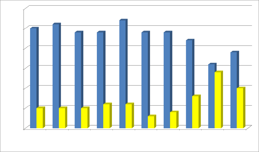
Consistent with previous research and the hypothesis, a chi-square goodness of fit
test confirmed a significant relationship between hue and the participants’ swatch
preferences, X
2
(9, N = 297) = 91.667, p < .001. As expected, color pairs 6-9 showed a
steady decrease in the number of times blue was preferred, while preferences for yellow
increased (see Figure 1). Consistent with the hypothesis, the colors were preferred almost
equally in the ninth pair, where yellow was selected 14 times and blue 16 times.
However, the tenth pair showed an unexpectedly large disparity between the number of
times each color was preferred, in favor of blue. Yellow was never selected more than
blue in any of the color pairs.
Brightness/saturation did have a measurable effect, however. A chi-square test of
independence revealed a significant relationship between color pair shown and color
preference exhibited by the participants, X
2
(9, N = 297) = 18.201, p = .033. Yellow was
chosen twice as often in the tenth pair as it was in the first pair. In both the eighth and
tenth pairs, however, blue was still chosen approximately twice as much as yellow.
Yellow’s worst showings were actually in pairs 6 and 7, where blue was chosen eight and
six times more often, respectively.
Discussion
The study may have been weakenend by the use of hue names to refer to the
swatches. The reason for which the hues were chosen, their extreme standings on the
preference scale, may have carried distracting connotations into participant evaluations,
as each participant was asked to circle either blue or yellow to denote preference.
COLOR PSYCHOLOGY 27
0
5
10
15
20
25
30
1
2
3
4
5
6
7
8
9
10
Times each color was preferred
Color pairs
Figure 1. Number of preferences according to color in each color pair.
COLOR PSYCHOLOGY 28
Furthermore, many participants remarked that the darker shades of both colors
appeared black, and many of the intermediate yellow swatches appeared greenish to
observers. Many participants were confused when they were told to refer to certain colors
as blue or yellow when the swatches did not appear to resemble either hue. In such a
circumstance, some of the participants may have resorted to circling blue in an effort to
convey general preferences in relation to their mental concepts of the two hues rather
than choosing between the two color swatches with which they were presented. Crozier
(1999) noted that people may select blue as their favorite color out of convention. The
sudden increase of yellow in pairs 8-10 may be due to the fact that yellow had just
become recognizable to the participants. If the study were to be repeated, the swatches
would not be associated with hue names, and participants would point to designate their
preferred swatches.
The overwhelming preference for blue, even at low brightness and saturation,
may be partially due to the age of the study’s participants. The mean participant age was
21. As Paul (2002) noted, 48% of individuals 21-34 years old listed navy blue/midnight
as their favorite shade of blue, as oppoosed to 32% of 35-54-year-olds and a mere 21% of
individuals 55 and over.
Another complicating factor may have been the quality of the laser output used to
produce the color samples. All the colors printed noticeably darker than they appeared on
screen, even from CMYK documents. If the study were repeated, color swatches would
be printed with ink rather than laser.
This study was ambitious in the sense that it sought a point at which saturation
and brightness could influence participants to choose the least-preferred hue over the
COLOR PSYCHOLOGY 29
most-preferred hue. Subsequent studies may find it beneficial to analyze other hue pairs
with less disparity between preference ranking (e.g., green and orange, red and purple).
Furthermore, seeing that blue was overwhelmingly preferred in pairs 1-6, the study could
be repeated with only pairs 7-10 to observe better the points at which
brightness/saturation begins to affect color preference.
COLOR PSYCHOLOGY 30
References
Alva, M. (2006, December 26). Color me Verizon red, T-Mobile pink and…: Big
telecoms are using hues to create brand identity. Investor’s Business Daily, A07.
Applebaum, M. (2005, May 23). Beware purple people eaters. Brandweek, 46(21), 46.
Berman, M. (2007). Street smart advertising: How to win the battle of the buzz. Lanham,
MD: Rowman & Littlefield.
Birren, F. (1997). The power of color: How it can reduce fatigue, relieve monotony,
enhance sexuality, and more. Secaucus, NJ: Carol Pub. Group.
Bleicher, S. (2005). Contemporary color theory and use. Clifton Park, NY:
Thomson/Delmar Learning.
Cheskin research finds that when it comes to packaging, looks count. (1998, September
21). PR Newswire, p. 6494.
Cimbalo, R. S., Beck, K. L., & Sendziak, D. S. (1978). Emotionally toned pictures and
color selection for children and college students. Journal of Genetic Psychology,
133(2), 303-304.
Crozier, W. R. (1999). The meanings of colour: Preferences among hues. Pigment &
Resin Technology, 28(1), 6-14.
Dettmer, J. (2003, September 2). Orange stakes its claim as color du jour. Insight on the
News, 19(19), 55.
Drew, J. T., & Meyer, S. A. (2005). Color management: A comprehensive guide for
graphic designers. Mies, Switzerland: RotoVision.
Elliot, A., & Maier, M. (2007, October). Color and psychological functioning. Current
Directions in Psychological Science, 16(5), 250-254.
COLOR PSYCHOLOGY 31
Eysenck, H. J. (1941). A critical and experimental study of colour preferences. American
Journal of Psychology, 54(3), 385-394.
Fehrman, C., & Fehrman, K. (2004). Color: The secret influence. Upper Saddle River,
NJ: Prentice Hall.
Gernsheimer, J. (2008). Designing logos: The process of creating symbols that endure.
New York: Allworth Press.
Gorn, G. J., Chattopadhyay, A., Yi, T., & Dahl, D. W. (1997, October). Effects of color
as an executional cue in advertising: They’re in the shade. Management Science,
43(10), 1387-1400.
Hemphill, M. (1996). A note on adults’ color-emotion associations. The Journal of
Genetic Psychology, 157(3), 275-280.
Hill, R. A., & Barton, R. A. (2005, May 19). Red enhances human performance in
contests. Nature, 435, 293.
Holitzschue, L., & Noriega, E. (1997). Design fundamentals for the digital age. New
York: John Wiley & Sons.
Huang, K., Lin, C., & Chiang, S. (2008, October). Color preference and familiarity in
performance on brand logo recall. Perceptual & Motor Skills, 107(2), 587-596.
Lambert, J. (2004, September 13). Colour schemers. Canadian Business, 77(18), 76-82.
Mastrota, F. N., & Mench, J. A. (1995). Colour avoidance in northern bobwhites: Effects
of age, sex and previous experience. Animal Behavior, 50, 519-526.
McManus, I. C., Jones, A. L., & Cottrell, J. (1981, July). The aesthetics of color.
Perception, 10, 651-666.

COLOR PSYCHOLOGY 32
Mehta, R., & Zhu, R. (2009, February 27). Blue or red? Exploring the effect of color on
cognitive task performances. Science, 323, 1226-1229.
Nelson, R. P. (1994). The design of advertising. Dubuque, IA: WCB Brown &
Benchmark.
Paul, P. (2002, February 1). Color by numbers. American Demographics, 30.
Peterson, L. K., & Cullen, C. D. (2000). Global graphics: Color: A guide to design with
color for an international market. Gloucester, MA: Rockport Publishers.
Saudi Arabia bans all things red ahead of Valentine's Day. (2008, February 12). [Online
news article]. Retrieved from
http://www.cnn.com/2008/WORLD/meast/02/12/saudi.valentine/index.html
Shank, M. D., & LaGarce, R. (1990). Study: Color makes any message more effective.
Marketing News, 24(16), 12.
Sharp national brand advertising campaign adds color to dynamic HDTV landscape.
(2010, March 18). [Online press release]. Retrieved from
http://www.sharpusa.com/AboutSharp/NewsAndEvents/PressReleases/2010/Marc
h/2010_03_18_QuadPixel.aspx
Singh, S. (2006). Impact of color on marketing. Management Decision, 44(6), 783-789.
Somasundaram, M. (1995, September 18). Red packages lure shoppers like capes
flourished at bulls—Marlboro, Coca-Cola, Colgate wear most popular color on
global market shelves. The Wall Street Journal, 226(54), A9.
Sturgess, D. J. (2008, August 11). A spectrum of missed opportunity. Brandweek, 49(29),
15.
Toufexis, A. (1983, July 18). The bluing of America. Time, 122, 62.

COLOR PSYCHOLOGY 33
Turquoise: Italy's hottest new color? (2009, October 26). [Web log post]. Retrieved from
http://www.colorassociation.com/blog/2009/11/7/tourquise-hot-new-color-in-
italy.html
Tyler, A. C. (1992). Shaping belief: The role of audience in visual communication.
Design Issues, 9(1), 21-29.
Valdez, P., & Mehrabian, A. (1994). Effects of color on emotions. Journal of
Experimental Psychology: General, 123(4), 394-409.
Wallace, R. (2002). Icons: Your brand’s visual language. Point of Purchase, 8(2), 18.
Wells, D. L., McDonald, C. L., & Ringland, J.E. (2008). Color preference in gorillas
(gorilla gorilla gorilla) and chimpanzees (pan troglodytes). Journal of
Comparative Psychology, 122(2), 213-219.
Williams, T. S. (2001). The graphic designer’s guide to pricing, estimating, & budgeting.
New York: Allworth Press.
Wong, W. (1997). Principles of color design: Designing with electronic color. New
York: John Wiley & Sons.
Wright, A. (1998). A beginner’s guide to color psychology. London: Kyle Cathie
Limited.
COLOR PSYCHOLOGY 34
Appendix
Color Models
RGB (Red, Green, Blue)
RGB is an additive color process (Wong, 1997) in which colors are created by
emitted light, as opposed to pigments (Holitzschue & Noriega, 1997). If red, green, and
blue are all set to full intensity, they will combine to form white light. The three colors at
50% form a medium gray; at 0%, they form black. The RGB model corresponds with
three cone systems in the human eye, which sense red, green, and blue (Drew & Meyer,
2005). Screens emit red, green, and blue electron beams (Wong). Combinations of these
beams at varying intensities can produce 256 colors with pixels of 8-bit depth. Projected
light has a greater gamut, or spectrum range (Holitzschue & Noriega), than printed colors
can offer (Drew & Meyer).
In March 2010, Sharp announced its plans to release AQUOS LED LCD TVs that
would incorporate yellow as the fourth subpixel (“Sharp National Brand,” 2010). Their
revolutionary RGBY quad pixel technology produces its own color gamut that better
approximates the range of colors visible to the human eye. Because its display cannot be
replicated on regular RGB screens, the AQUOS slogan is, “You have to see it, to see it”
(“Sharp National Brand,” 2010).
CMYK (Cyan, Magenta, Yellow, Black)
CMYK, a subtractive color process, is directly inverse to RGB (Wong, 1997).
Unlike a light source emitting colored light, CMYK print material actually absorbs these
colors from light (Holitzschue & Noriega, 1997). Cyan, magenta, and yellow ink absorb
red, green, and blue light, respectively. Unlike RGB, which emits and reveals, CMYK
COLOR PSYCHOLOGY 35
absorbs and conceals. White appears only in the absence of subtractive pigments, and
true black appears when cyan, magenta, yellow, and black are all set to 100% (Drew &
Meyer, 2005). Based on this model, color printers use cyan, magenta, yellow, and black
ink.
HSB (Hue, Saturation, Brightness)
The HSB mode measures colors in the traditional dimensions of hue, saturation,
and brightness (Wong, 1997). It is also called HLS (hue, lightness, saturation) and HSV
(hue, saturation, value). It is neither additive nor subtractive; rather, HSB is a tool for
color selection in design software (Holitzschue & Noriega, 1997). Its color map is a circle
with no saturation at its center and full saturation of the various hues around its
circumference. A vertical slider bar allows the user to alter the value of the entire map.
CIE
The Commission Internationale de l’Eclairage (CIE) has devised a complex color
model that measures not only color production, but human color perception (Drew &
Meyer, 2005). Like RGB, the CIE system uses an additive red, green, and blue model.
However, this three-dimensional model takes into account not only visible color but also
the light source present, and the observer. It includes the tristimulus values X, Y, and Z
that calculate how much red, green, and blue humans with normal vision can perceive.
CIE’s gamut is even larger than the spectral range humans can perceive. Some CIE
colors are theoretical only, as they are beyond the visible gamut.
